Progress
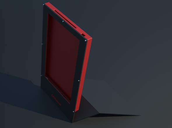
Hopefully this is starting to look a little more recognizably like a computer. Sure, the geometry looks pretty simple, but each hole for a screw or USB port represents waaay to much time measuring/printing a paper template/placing/getting it wrong/repeat. Logo placement is provisional, looks kinda stupid as is. Right now I’m playing with a red/charcoal powdercoat or automotive matte paint job, but the question is how much red is too much red. I feel the thing also looks a bit too unadorned – I’m considering doing a large amount of laser engraving on many of the flat grey surfaces. What to do with all that empty space on the face?


Reverse the red and black–or just make the whole thing black, with the logo in red. i like the lines from your original conception.
November 22, 2010 at 11:30 pm
First: congrats on your big project. Next: I suggest curved corners. But maybe it is too late in the process for that. Also: Put the logo on the back, like all the laptops have these days. It is a good way for computer companies to advertise. Next: I find the red very strong. Maybe a different tone of red? Something a little more sleek, business-like. Depends on your target clients, yes. But knowing who the target client is, is important cause these companies are looking to make money and a good way of selling a technology product is to make it look good and make it look futuristic.
The best of luck. I just happened to be surfing the internet with little to do and found your facebook post about this. Glad I found it. Be well!!!!
November 23, 2010 at 5:05 am